The Global Extension contains a tab for the
DrawHeader settings.
Use Old DrawHeader Template
Uses the old DrawHeader template, which does not provide the option of
modifying the behaviour at the template level and relies on the
procedure imported into your application. This is not recommended except
for temporary backward compatibility if you have custom code in the old
imported procedure.
Text Tab
Heading
At the local level the heading text is usually either set
specifically, or defaults to the Window Caption property. If you add a
value here then this will be used instead of the Window Caption.
Use AnyFont First
Retrieves the Font, and FontSize to use from AnyFont (if it is in the
app).
Use Makeover Next
If Anyfont is not in the app, or has not set the font, then use the
Makeover setting (if it is in the app.)
Override With
If a Font is set here then it overrides the AnyFont and Makeover
settings.
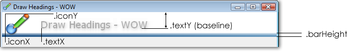
Text X Position
The position of the text (horizontally) in the image. If Icons are
being used then a value of 75 is recommended. If Icons are not being
used then a value of 20 is recommended.
Auto Text Shadow
If this is on the default (appropriate) values for the text shadow is
used.
Text Shadow
If the Auto-Text Shadow is off, then enter your preferred shadow
values here.
Shadow Color
The color of the shadow. Usually either a pale grey, or a pale version
of the font color.
Icons Tab
Auto-Icons
If Auto-Icons are on then an icon will be selected automatically,
based on the data table being used by the procedure. For example a
Form on the CUSTOMERS table will result in the use of CUSTOMERS.ICO.
The icon can also be set locally for each window.
Icon Size
The size of the icon to use in pixels - defaults to 32.
Icon
If an icon value is set here then it will be used on all windows where
a local icon is not set. In other words, this is the default icon that
will be used by the windows. If this icon is set then Auto Icons will
not be applied.
Icon X Position
The horizontal offset of the Icon in pixels.
Icon Y Position
The vertical offset of the Icon in pixels.
Background Tab
Background Color
The background color for the header.
Bar Color
The color of the horizontal separator at the bottom of the header.
Shade Bar To
If this is set to something other than COLOR:NONE then the bar will
shade from the Bar Color to the Shade color.
Bar Height
The height of the bar, in Pixels.
Background Shading
The Shading style to use for the background.
Advanced Tab
Set Class Name
This is used to change the class used by all the local procedures. See
Advanced: Creating a Custom DrawHeader
class.
Init Later, in ASK
This option moves all the initialization code from the
ThisWindow.INIT
method to the
ThisWindow.ASK method.
A second Global Extension exists called Activate
Auto Headers. If this is added globally then the Draw Auto Header
extension template is added to all the procedures in the app. This is a
fast approach to adding all the local extensions if you want them on all
the windows (at runtime).
The local extension options are the same as the
global extension options.
Where a Radio or Drop option is set to Default then
the global setting is used.
For Colors, if the color is set to Color:None
then the global setting is used.
